I appeared again as a guest on Washington Weekly, a podcast produced by the DC bureau of the Japanese broadcasting company TBS.
This week, one of the main topics was the brouhaha with Cracker Barrel’s logo. As someone who loves communications, messaging, and art, I really enjoyed talking about this! I also mentioned the 2018 logo change of Dartmouth College (my alma mater); the old one, shown here, was problematic in its portrayal of the school’s history (it was founded as an institution to educate Native American people).
The episode (in Japanese) is available at the above link.
I was honored to be a guest on Washington Weekly, a podcast produced by the DC bureau of the Japanese broadcasting company TBS!
Washington Weekly discusses political and economic news in the DC region. The DC bureau chief, Wakui-san, explains the latest developments (especially information that may not be getting a lot of coverage in Japan) in bite-size, digestible pieces, often welcoming guests who are experts in certain areas. I’ve enjoyed listening to many of their episodes, and it was really cool to be able to play a small part in their episode this week!
Going forward, I’ll be a recurring guest discussing various English phrases/words that were in the news that week, so if you listen to Japanese podcasts, please take a look at the links above!
“Compassionate Phrases in English (#18): Preparing for and Responding to Unforeseen Circumstances”
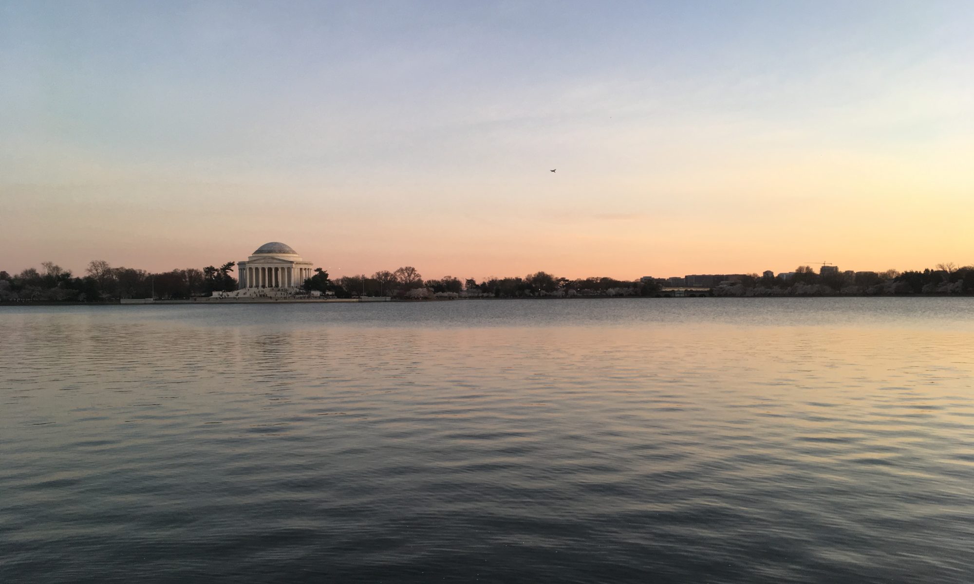
Here’s the latest for my column in “Sakura Shimbun,” a Japanese community paper in DC and Houston. Many regions in the U.S. and Japan grapple with storms throughout the summer season. Even when they don’t turn into hurricanes or typhoons, sudden storms can cause numerous problems, including flight cancellations and delays, cancellations of outdoor events, and power outages. In this issue, I discuss phrases that can be used to communicate with clients when the services we provide are affected by bad weather and other unforeseen circumstances.
まず、様々なシナリオを検討し、事前にお客様に伝えるべきでしょう。雨天でもある程度柔軟に対応できる場合は、In the event of rain, the wedding ceremony will move indoors, but please understand that it will be standing room only due to the limited space. といった説明で済むでしょう。お客様に迷惑をかける可能性がある場合には、As a small, volunteer-led organization, we are unfortunately unable to provide refunds for weather-related incidents. If we must cancel due to rain, we will email all registered guests by three hours before the start of the performance. などとより丁寧に理解を求めることができます。
それでも想定外のことが起きた場合には、その場でお客様の反応やニーズを見ながら、We apologize that our performers are delayed due to a storm at their departing airport. While we wait for them, we would like to offer everyone a round of free drinks. Please present your ticket to the bartender. などとオファーできます。内輪の集まりであれば、あまり謝罪に力を入れることなく、Our musical guests are currently stuck in traffic, so we borrowed a boombox and a few mics from the venue. Why don’t we start the party early by enjoying some karaoke? などと楽しく盛り上げていけるかもしれません。
緊急時への備えも重要です。イベントの開会挨拶の前には必ず、The exits are to your right and behind you. In case of fire or other emergencies, please follow the exit signs and wait outside the building for further instructions. などと一言説明するとよいでしょう。実際に何かあった場合には、Please remain calm, tread carefully, and do not push others. There are multiple exits, so please look up and find the one closest to you instead of following everyone else. と繰り返し、雑踏事故を防ぐことが重要です。病気やけがといった個人の緊急事態に関しても、We want to protect your health and safety while you enjoy the concert. If you feel ill or sustain any injuries, please speak to a staff member nearby or head to the medical tent at the entrance of the park. などと言えます。
I was incredibly honored to welcome the wonderful John Onoda, who I respect immensely as a top communications expert–and one of the wisest people I’ve ever known. I met him through the U.S.-Japan Council, where, as a board member, he provides valuable advice about the strategic direction of the organization. He is a principal at iQ 360, a strategic consulting firm with clients in the United States and Japan, and serves on the board of The Arthur W. Page Center for Integrity in Public Communication. He has led communications at companies including General Motors, Levi Strauss, Visa USA and Charles Schwab, and has decades of experience providing counsel to other major global corporations, universities, NGOs and government agencies.
We discuss how John’s upbringing in Gary, IN (where the only other Asians were his family members) affected his identity; how he taught himself to succeed in communications as an introvert; the importance of cultivating our humanity to thrive as individuals and workers even while technology increasingly takes over our jobs; how reading trains us to empathize with others and helps us fight forces that divide us; and how we can “find our tribe” by exploring different lifestyles.
Many thanks to John for kindly taking the time to share his fascinating life journey (as a fellow introvert, I especially loved the story of “Robot John”!) and great insight into strategic communications. He’s always been decades ahead of others, and I learned so much from his advice that no matter what happens with technology in the future, the best way to succeed long-term is to cherish and continue to foster human qualities like integrity and empathy.
今回は、私が尊敬してやまない広報専門家であるジョン・オノダ氏をお迎えしました。ジョンさんは私の前の職場、米日カウンシルの評議員で、広報活動のみならず、組織全体の戦略的方向性についていつも貴重なアドバイスをくださっていました。日米を拠点とする戦略コンサルティング会社、iQ 360のプリンシパルであり、広報活動のインテグリティ(誠実性)を促進する組織、Page Center for Integrity in Public Communicationの理事も務めています。ゼネラルモーターズ、リーバイス、ビザ、チャールズ・シュワブなど、数多くの大手企業でコミュニケーション部門を率いてきたほか、大学、NGO、政府機関に対しても、数十年にわたってコンサルティングを行ってきた方です。
“Compassionate Phrases in English (#17): How to Protest in Writing”
Here’s the latest for my column in “Sakura Shimbun,” a Japanese community paper in DC and Houston. While protests against ICE raids and other topics continue across the United States, some demonstrations have turned violent, and troops have been deployed under the pretext of maintaining order. In some cases, there seems to be a real risk of injury or arrest, and physically making a protest has become more challenging. In this issue, I discuss how to protest in writing, not only in relation to politics, but also in matters related to everyday life.
まず、相手に直接抗議する場合。メールや書簡で、We have found extensive damage to your dorm room. Please pay the fines immediately, or you will forfeit the right to stay with us next year. など、相手に求める行動と、その言葉に従わなければどのようなことになるかを具体的に示すとよいでしょう。逆に、新聞など多くの人が見る場では、In the article “The Best Hotel Restaurants in Town” that was published yesterday, you called our French pastries “inauthentic.” As the restaurant’s pastry chef, let me illustrate why that is not the case. などと反論投稿を書けば、風評被害を抑えるとともに宣伝も兼ねた抗議をすることができます。
訴訟などを通じて相手と非公開のやり取りをしていても、既にメディアに大きく取り上げられている場合には、三人称を使った声明を出すこともできます。The university is proud to remain a global institution that welcomes students from every country, and reiterates its call for an immediate reversal of the government’s decision. などと書けば、相手にさらなる圧力をかけるとともに、問題に真剣に取り組んでいることを組織内外に示すことができます。
直接被害に遭った当事者でないものの、関連機関として抗議をすることもあるでしょう。国連は、We strongly condemn these atrocious acts that violate basic human rights. といった表現をよく使いますが、特定の国ではなくその国による行動だけを非難する、曖昧な言い回しとして批判されがちです。中立的でなければならない組織なら仕方のないことですが、ほとんどの場合は、As an organization dedicated to Asian American history, we greatly oppose the public library’s decision to take down the webpage recounting the story of the 442nd Regimental Combat Team, and request that they restore it immediately.
I was so happy to welcome the wonderful Kazuyo Kato, who I respect immensely as the Executive Director of Japan Center for International Exchange (JCIE) USA, and who I’m proud to call a friend. Born in Australia and raised in Egypt until she was three years old, Kazuyo moved between the U.S. (Washington, DC and San Francisco) and Japan throughout her elementary to high school years. She has built her career at organizations focused on U.S.-Japan relations and international affairs, including the Japan Society in New York, the U.S. and Japan entities of the Sasakawa Peace Foundation, CSIS, and Armitage International.
We discuss Kazuyo’s upbringing in multiple countries; how she overcame the challenge of learning languages and societal expectations; why she decided to work in the nonprofit sector and the importance of people-to-people exchange; and how she developed her own leadership style and what she learned from great leaders like Richard Armitage.
Many thanks to Kazuyo for kindly answering my very personal questions! I appreciate her being open about the struggles of navigating friendships while learning languages. Her advice on leadership is particularly touching when considering how she built her career and confidence over time, and I’m sure many people will find her words encouraging and inspiring.
“Compassionate Phrases in English (#16): How to Get Through Uncertain Times”
Here’s the latest for my column in “Sakura Shimbun,” a Japanese community paper in DC and Houston. Federal policies in the U.S. are changing at a dizzying pace, and worrisome news continue to flood the headlines. With ongoing layoffs at government agencies and funding cuts to academic institutions, many might be anxious whether their industry or field will be next. In this issue, I explore how we might alleviate some of these concerns and comfort one another during these uncertain times.
After I submitted this piece, the ICE raids started. I am shocked by how immigrants are suddenly taken away, as well as the administration’s decision to send the National Guard to counter protestors in Los Angeles. I sincerely hope that everyone remains safe, and that things calm down as quickly as possible.
まず、自分の運営する組織が資金打ち切りや関税の影響で経済的に苦しくなる可能性が高い場合。幹部の従業員に対しては、Let’s create a task force and meet weekly to discuss other funding sources, such as state government agencies and private foundations. などと言えますし、担当プログラムの資金が打ち切られて解雇されることを心配している部下に対しても、透明性を高く持ち、Your concern is completely understandable. I don’t have a clear solution yet, but we are working on diversifying our income. In the meantime, let’s talk with other colleagues about how we might adjust your portfolio. などと言えるでしょう。
国際開発や教育などで働いている方は、業界自体が混乱に陥り、不安に駆られている場合が多いでしょう。長らく働いた後で職を失った友人には、If you have enough savings, this may be an opportunity to pursue other areas you’re interested in. と言って、興味がある分野を一緒に書き出したり、スキル向上の機会について話し合ったりできるかもしれません。逆に、ちょうど開発分野の修士号を取得した若手などには、Don’t give up on the industry just yet! Now that the U.S. is pulling away, other entities like international organizations and nonprofits probably have a greater need than ever. This might be a good time to work in developing countries. などと提案できるでしょう。
まだ直接影響を受けていなくても、ニュースを見るだけで不安になるという人もいるでしょう。そういった友人に対しては、We have to hope for the best but prepare for the worst! If you’re worried about your job, why don’t we update our resumes and take evening classes together to gain more skills? とキャリアに関する提案をしたり、Maybe you can limit your news browsing to the morning and lunch time. After work hours, why don’t you turn off the news alerts and read a good book instead, so that you can go to bed happier? と生活に関するアドバイスをしたりできます。
I was so happy to welcome interpreter and analyst Lefteris Kafatos, who I’ve long looked up to. Lefteris went on the JET (Japanese Exchange & Teaching) Program in Okinawa and served as a diplomatic interpreter at the U.S. Department of State, interpreting for Presidents Obama and Trump on several occasions. He now writes (in both English and Japanese!) for The Japan Lens, where his focus is the U.S.-Japan alliance, Japanese politics and foreign policy, and regional dynamics in the Asia-Pacific. Lefteris has master’s degrees in Japanese-English Conference Interpreting from the Middlebury Institute of International Studies at Monterey (MIIS), as well as in International Affairs from UC San Diego.
We discuss his upbringing and identity as a Greek American; how his interest in Japan evolved over time as a student, interpreter, and analyst of U.S.-Japan relations; how he stays calm when interpreting for heads of state and other high-powered individuals; and how we can continue to maintain and strengthen the U.S.-Japan relationship despite recent uncertainties like tariffs. I’m amazed by not only his linguistic talent and hard work that brought him to where he is, but also his willingness to continue to study and grow.
ポッドキャスト「CrossWorld Puzzles」の最新エピソードです。今回は、通訳の先輩であるレフテリス・カファトさんの話を伺いました。大学で日本語を勉強し始めた後、JETプログラムや日本での勉強・勤務を経て通訳となり、国務省の日本語通訳者となってオバマ・トランプ両大統領の通訳も務めたレフテリスさん。今は「The Japan Lens」と呼ばれるウェブサイトを運営し、日米同盟や日米関係を様々な観点から分析して、両方の言語で記事を書いています。
“Compassionate Phrases in English (#15): How to Compromise–and How Not to”
Here’s the latest for my column in “Sakura Shimbun,” a Japanese community paper in DC and Houston. People around the world are now nervously following updates on their countries’ tariff negotiations with the U.S. Throughout history, we have always negotiated with each other on a wide range of topics. In this issue, I discuss how to compromise on certain points–while maintaining our position in areas where we cannot give in.
ビジネスで妥協しやすい点の一つは、値段や個数かもしれません。新規のお客様から値下げをお願いされたら、While we are unable to lower our costs permanently, we are happy to offer a one-time 50% discount on our annual fee. などと申し出ることができます。常日頃お世話になっている顧客なら、To thank you for your patronage, we will include three free samples of our latest product in every shipment. などと言えます。
プライベートでも妥協することは多いでしょう。ルームメイトと家事を分担するときは、How about we take turns cooking dinner from Monday through Thursday, and dine on our own on other days? などと提案することができます。同居を始めたばかりのカップルなど、ある程度親しければ、How about I pay a higher portion of the rent while you look for a job? We can discuss again how we split it once you find a full-time position. などと申し出ることもできます。
他方、譲れない点はしっかりと守らなければなりません。何がネックかを明確にすれば、状況も改善されやすいでしょう。組織としては、As a cleaning service, we must protect our employees’ safety. Unless these wobbly stairs are fixed, I’m afraid we’re unable to come work for you. などと主張できます。また、たとえば保護者としては、Our child’s wellbeing is most important to us. If you cannot clearly explain your lunch options for food allergies, we must choose another school. などと強く言うこともできます。
異なる要望を組み合わせることも可能です。対面で参加したい人としたくない人、参加費を払える人と払えない人がいるイベントの場合、To accommodate all members, this seminar is presented in a hybrid format: online attendees are welcome to attend for free, while in-person attendees are requested to pay $50 for the post-seminar networking lunch in DC. などと言えます。
I was super excited to welcome my longtime friend Mari Yobp, who I’ve known since middle school! Mari is an artist and poet raised in Japan. After graduating from Musashino Art University, she worked as an art teacher at a school in Osaka (where she met her future husband) and immigrated to the U.S. She is currently based in Pittsburgh, PA, and has also lived in Idaho. Mari draws and paints mostly flowers in watercolor. She also writes Tanka poetry and publishes her work in a poetry magazine.
We discuss her philosophy in creating art; how she met her husband and built her own community in the U.S.; how she keeps in touch with the Japanese language and writes poetry; how she has contended with her child’s medical challenges; and how she stays positive no matter what challenges come her way.
Many thanks to Mari for sharing her wisdom. She’s always been an inspiration and source of strength for me, and I’m sure many will find her words and kind demeanor comforting.
The video podcast with Mari is below, but for more information, please see photos (and the episode transcript) here: https://crossworld-puzzles.com/episode9-mari/. This webpage includes a lot of Mari’s art, and should not be missed!